Showing posts with label formatting. Show all posts

Monday, September 29, 2014

eBook Formatting: Ellipsis, Nonbreaking Spaces, Em Dashes

I wrote a couple of posts in September and October, 2011, on formatting for eBooks and print. The first post covered the ellipsis, the second em and en dashes. In summary, for the click-shy, I recommended:

Ellipsis


Print Formatting


I recommend the use of space-period-space-period-space-period-space (three periods, each surrounded by a space) when the ellipsis is in the middle of a sentence.

If ellipsis is at the end of a sentence, instead of the last space, insert whatever punctuation mark is appropriate. I don't use a fourth period at the end of a sentence in fiction like I would if I were publishing non-fiction. A close quote mark, question mark, or exclamation mark would immediately follow the last period with no additional space.

You or may not need to use a nonbreaking space between the preceding word and the first period, to keep them on the same line. That's handled in the copy-fitting stage, when you're examining each page of your manuscript in your page layout program.

eBook Formatting


I recommend the use a true ellipsis in eBook formatting. The only downside to this is, the eReader could choose to split a line at the end of the word, making an orphan of the ellipsis. The only way I know to prevent this would be to use an HTML editor and insert a zero width non-breaking space. Editing HTML is outside my skill set. I write my novels in Scrivener and use it to generate my eBook files.

In a comment I made at the end of the ellipsis post, I wrote you could also use the three periods surrounded by spaces recommended in Print Formatting. To make this work, you would need to make each space a nonbreaking space or risk the eReader splitting the periods up if it runs out of space on the line it's working on.

The risk of an orphaned ellipsis (or em dash) is small, especially on larger-screened eReaders like the Kindle Fire, iPad, Nook, and even the Kindle Paperwhite. I recently bought an iPhone 6 Plus so I'll be reading on my phone again, when hauling my iPad along is inconvenient, but I think most people are reading on larger devices now.

Em Dash


Print Formatting


My recommendations are unchanged from my earlier post for the use of em dashes in print formatting.

eBook Formatting


I've softened on my recommendation to use a soft space before and after em dashes when they appear in the middle of sentences. I think it makes for a more visually appealing line on an eReader, but I don't see it used much.


eReader software can add space between the em dash and surrounding words when justifying a line, which, in my opinion, is more visually appealing.

When em dashes appear at the end of a line, we have the same dilemma we had with the ellipsis: the eReader may orphan the em dash, like this:

Awkward looking, no?

But, is this any better?

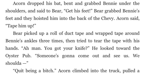
I inserted a nonbreaking space after "shoulda" to prevent the eReader from making an orphan of the em dash and close quote. If you choose this option, you'll have to do the same for every em dash that appears at the end of a line, to be consistent. 


I for one, since I don't edit HTML, will stick with option one and take my chances that the eReader will have mercy on my eBook and orphan few or no ellipses and em dashes.


Thanks for stopping by. While you're here, you could check out my novel The Mighty T for only 99 cents. It's a great introduction to my Grant Starr novels. Available at Amazon or anywhere fine eBooks are sold.

Monday, October 3, 2011

Formatting For ebooks and Print - Part 2: Em and En Dash

Last week I discussed the proper use of the ellipsis here. Today I’d like to tackle the correct use of the em and en dash. (By “correct use” I mean correct as I see it currently used in the fiction I’ve been reading lately and how I currently use it.)

The em dash looks like this:  

It’s created on a Windows machine by holding down the Alt key while typing 0 1 5 1 on the numeric keypad.

The en dash looks like this:  

It’s created on a Windows machine by holding down the Alt key while typing 0 1 5 0 on the numeric keypad. You’ll notice it’s shorter than the em dash, as the lowercase letter “n” is more narrow than the lowercase letter “m.”

The en dash is typically used when writing out ranges, like this:
The odds for my horse winning the race are ten–to–one. 
I don’t see the en dash used very often in fiction.


The em dash is typically used to point out a break of thought, like this:
A third ghost looked like the man on the Quaker Oats box. He appeared four weeks ago and was now making daily appearances, but so far had been mute. He would speak one day—they all eventually talked—and then there would be no shutting him up.
There is typically no space before or after the em dash, either in print books or ebooks. I have found exceptions, though, a few ebooks. A space was placed before and after the em dash. This made short justified lines look better on the ereader screen but had little effect on long lines and no effect on ragged-right lines.

What do I mean by long and short justified lines? Because ereaders don’t hyphenate lines, when justifying lines with large words, especially on a small ereader screen, large spaces are inserted between words. This is necessary to ensure that the end of the last word on the line is flush on the right. If there’s an em dash on the line, it will appear jammed together with the words before and after it. If you place a space before and after the em dash, the ereader will add space between the words and the em dash and the line will appear more pleasant to the eye.

Your choice. I like the appearance of the extra space far better on small readers like the iPhone. It makes little difference on my iPad, though. What devices do you think your readers will use most to read your books?

An em dash is also used when a speaker has been interrupted, like this:
She checked her watch: no time for a latte, and ran into someone. Knocked hard, she grabbed a parking meter and prevented a nasty fall, said, “I’m sorry, I guess I wasn’t looking at where I—”
The wall to her left puffed; shards of brick bit into her arm. Her face exploded.
This woman was interrupted by a bullet. Normally the interruption comes when another character butts in.

When used to point out a break in thought, the em dash can be overused, so apply it judiciously.


By comparison, the regular hyphen looks like this:  -

Here they are, from small to large: hyphen, en dash, em dash:  -   –   —

Friday, September 30, 2011

Formatting For ebooks and Print - Part 1: The Ellipsis

One of the biggest gripes readers have about self-published writers, aside from typos, which is gripe number one, is that their ebooks and print books look unprofessional. This post is the first of several I plan on writing about formatting books for distribution.

I have a background in typography, as a hobby. Years ago I studied typography as if it was my profession, even though it wasn’t. I bought a couple dozen good books on the subject and own about three thousand typefaces. (Could you guess I have a compulsive personality?) I had the best-looking business brochures.

Now that I’m (finally) ready to offer THE MIGHTY T as a print book, I’m hoping all those hours spent pouring over typography how-to books will come in handy.

Today I’d like to talk about the ellipsis, as it’s commonly used in today’s printed fiction. In case you don’t know, an ellipsis is used when a character doesn’t finish his or her sentence, either because they still thinking about what they’d like to say, can’t remember a word, or they drift off on purpose to allow the person or persons they’re speaking to finish the sentence for them.

For example, from THE MIGHTY T, Chapter 1:
“Shut up!” he shouted at them. “You’re gonna fuh . . . fuh . . . fuh . . . screw this up!”
In this example, Danny, the crazy sniper, is trying to say the F-word, but can’t.

Here’s another example:
“We were planning on taking the kids to Mulligans later,” Bensen said. “Drive them around the go-cart course and let ’em whack each other with golf clubs, but we can do that next Saturday . . .” He trailed off, letting Grant make the call.
Here Bensen “trails off” to allow Grant to make the decision as to whether they’ll return to the dam that night, or tomorrow. Grant picks tomorrow because it’s not urgent-urgent, and his friend already had an evening planned with his family.

I imagine that “trailing off” may not necessarily be verbal, but rather may be body language or a certain expression. Instead of explaining all that, you can add an ellipsis, followed by a few words of explanation if the reason for the ellipsis isn’t obvious to the reader.

I use the ellipsis quite a bit in dialogue because most people I hang around with don’t speak in full and correct sentences. We get distracted and don’t finish our thoughts; we open our mouths before we know what we’re going to say, necessitating a hasty retreat when we realize we might say something we’ll regret; we stutter; and we “trail off” as Bensen did. I think it adds realism to dialogue.

Typographically speaking, when printing an ellipsis you should use the ellipsis character, which is not just three periods in a row but rather the ASCII character produced by holding down the Alt key while typing 1 3 3 on the numeric keypad. (On the PC; Mac users will have to figure it out.) This produces this character:


Notice that it’s slightly different from typing three periods in a row:

...

The spacing is different. (In printed text, the ASCII ellipsis is wider than three periods typed in succession. It may not look the same on your computer monitor.)

After considerable study, most modern works of fiction are not typeset using the typographical ellipsis because it would look awkward on the printed page or ebook reader. Instead of the ellipsis character, typesetters now use this:

. . .

A space followed by a period, followed by a space, followed by a period, followed by a space, followed by a period—three spaces before three periods. After the last period you add another space if there are more words before the closing quotes, or any punctuation, even the closing quotes, other than a period. (See my examples if this isn’t clear.) Typographically, if the ellipsis ends the sentence you should add a final period. I just don’t see it being done, though, so I leave it off.

Why are modern novels set like this when it’s typographically incorrect? Because it improves the spacing on the printed or electronic page, especially on the printed page as all modern novels are set with justified text, not ragged-right.

“Justified” text means the last letter of the last word of each line in a paragraph lines up on the right, like how this paragraph is set. Page setting software has to add space between words to make the line stretch. Setting ellipses with a space before the ellipsis, and spaces in between each period, allows the software to stretch the ellipsis, making the line more visually appealing to the eye. 

I have several reading apps on my iPad;  most allow me to view the text with either ragged-right or justified paragraphs. Writing the ellipses as I suggest improves the appearance of ragged-right paragraphs, though perhaps not as much as with justified paragraphs.


I hope you’ve found this information helpful. Obviously, it’s better if you can afford to pay someone to format your manuscripts for you, but if you have to do it yourself, you might as well do it right.