Showing posts with label self-publishing. Show all posts

Monday, September 29, 2014

eBook Formatting: Ellipsis, Nonbreaking Spaces, Em Dashes

I wrote a couple of posts in September and October, 2011, on formatting for eBooks and print. The first post covered the ellipsis, the second em and en dashes. In summary, for the click-shy, I recommended:

Ellipsis


Print Formatting


I recommend the use of space-period-space-period-space-period-space (three periods, each surrounded by a space) when the ellipsis is in the middle of a sentence.

If ellipsis is at the end of a sentence, instead of the last space, insert whatever punctuation mark is appropriate. I don't use a fourth period at the end of a sentence in fiction like I would if I were publishing non-fiction. A close quote mark, question mark, or exclamation mark would immediately follow the last period with no additional space.

You or may not need to use a nonbreaking space between the preceding word and the first period, to keep them on the same line. That's handled in the copy-fitting stage, when you're examining each page of your manuscript in your page layout program.

eBook Formatting


I recommend the use a true ellipsis in eBook formatting. The only downside to this is, the eReader could choose to split a line at the end of the word, making an orphan of the ellipsis. The only way I know to prevent this would be to use an HTML editor and insert a zero width non-breaking space. Editing HTML is outside my skill set. I write my novels in Scrivener and use it to generate my eBook files.

In a comment I made at the end of the ellipsis post, I wrote you could also use the three periods surrounded by spaces recommended in Print Formatting. To make this work, you would need to make each space a nonbreaking space or risk the eReader splitting the periods up if it runs out of space on the line it's working on.

The risk of an orphaned ellipsis (or em dash) is small, especially on larger-screened eReaders like the Kindle Fire, iPad, Nook, and even the Kindle Paperwhite. I recently bought an iPhone 6 Plus so I'll be reading on my phone again, when hauling my iPad along is inconvenient, but I think most people are reading on larger devices now.

Em Dash


Print Formatting


My recommendations are unchanged from my earlier post for the use of em dashes in print formatting.

eBook Formatting


I've softened on my recommendation to use a soft space before and after em dashes when they appear in the middle of sentences. I think it makes for a more visually appealing line on an eReader, but I don't see it used much.


eReader software can add space between the em dash and surrounding words when justifying a line, which, in my opinion, is more visually appealing.

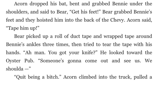
When em dashes appear at the end of a line, we have the same dilemma we had with the ellipsis: the eReader may orphan the em dash, like this:

Awkward looking, no?

But, is this any better?

I inserted a nonbreaking space after "shoulda" to prevent the eReader from making an orphan of the em dash and close quote. If you choose this option, you'll have to do the same for every em dash that appears at the end of a line, to be consistent. 


I for one, since I don't edit HTML, will stick with option one and take my chances that the eReader will have mercy on my eBook and orphan few or no ellipses and em dashes.


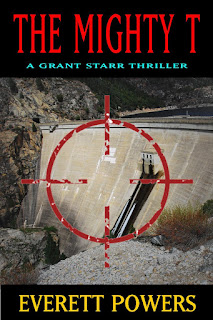
Thanks for stopping by. While you're here, you could check out my novel The Mighty T for only 99 cents. It's a great introduction to my Grant Starr novels. Available at Amazon or anywhere fine eBooks are sold.

Friday, September 26, 2014

The King of Round Valley eBook Released

Yeah!
The eBook version of my new novel, The King of Round Valley, was released on Kindle, Smashwords, and Nook today. Smashwords will distribute to the iBooks store and a few other small retailers. The paperback version will be available in about two weeks.

(At the time of this posting, Smashwords is the only retailer where the book is live. I'll update this page and my blog when the other sites go live.)

The King of Round Valley was a fairly easy book to write, but fairly difficult to edit. The entire editing and pre-publishing process too four months—way too long. I blame my wife because, hey, isn't that what wives are for? (Joking, of course.) It just was a difficult book to edit.

As usual, I came to like many of my characters. In past books, some of my favorite characters were bad guys. Take Death of a Matador. I really liked Manny, the murderous, greedy mayor. Perry Dillard, not so much. I liked writing Mindy in The Mighty T and Sunset Hill. Lightfoot was far too cruel to like.

I can't say that I liked Johnny Pipe, the main bad guy in The King of Round Valley, but I sympathized with him having to work with so many dimwitted people. That's gotta wear on you eventually. I enjoyed writing Acorn and Bear because they were so dumb they were fun, but I could never empathize with them. They were too brutal.

I hope you enjoy the novel.

Thursday, February 7, 2013

Fictional Characters and Chopping Up Chickens


I’ve always thought my novels were plot driven, but now I realize that’s not entirely true. A good story is critical, but a novel without good characters isn’t likely to be finished.

Where do fictional characters come from?

- From the author’s imagination: They’re made up.
- From the author’s experiences: They’re written after someone the author knew personally or knew of.
- A combination of the preceding two statements. Most characters probably fall into this category.

One of the scenes in my horror novel CANALS involves two Hispanics named Tony and Bobby, each a year out of high school. They met in fourth grade when Bobby, who was the biggest kid in school, bigger than any sixth grader (BIG!), saved Tony from an ass kicking. Bobby sat on the other kid until the bell rang, then shoved his face in the grass as he got up. The two were inseparable after that.

Until the monster ate one of them. You’ll have to read the book to learn who gets to live, though he was never quite the same after watching his buddy get munched.

Here’s a rather long, and explicit, excerpt from the book:

Tony spun an empty bottle toward the canal, watched it arch through the moon-lit night, heard the splash, and said, “Two-for-two, holmes. At this rate I’m going to take Kobe’s place on the Lakers, aye, ése?”
“Don’t call me ése, you wetback,” Bobby said. “You don’t even know how to speak Spanish, fool, and you damn sure can’t shoot like Kobe.” They were Lakers fans: Kobe Bryant was the man.
“Get your fat arm off the cooler, bitch,” Tony said, trying to get in the ice chest.
“Bitch hell. You ain’t got no bitch, bitch, unless you count that Wanda bitch at work.” Bobby laughed as he moved his arm and pulled a joint out of a plastic baggie. “Shit, you couldn’t even get in Wanda’s panties.”
“Shut up, ése. Wanda’s got back, man. I’m gonna get me some of that, you wait and see.”
Bobby laughed again. “You stupid wetback, I’ll have a gray beard down to my ass before you get with Wanda. Besides, she’s ugly. And don’t call me ése, bitch.”
 “Man, but could you do Yolanda?” Tony said, grabbing his crotch. “That bitch is fine!” He took a long pull from his bottle.
“Shit yeah, I could do Yolanda four times a day, bitch.” Bobby reached across the cooler and said, “Gimme five for Yolanda’s fine pussy.” Although neither boy had seen or touched Yolanda’s genitals, nor would they ever get close, they fived it across the beer cooler.
Bobby lit the joint and took a deep hit, holding in the potent smoke as long as his burning lungs allowed. He exhaled slowly, tilting his head up, blowing smoke at the stars.
“Gimme the smoke, ése,” Tony said, reaching across the cooler, tapping Bobby’s arm.
“I just got it started, fool. All I got was paper. Let me get some weed first, bitch. And don’t call me ése.”
“Bitch this, bitch,” Tony said, grabbing his crotch again and watching his friend hit on the joint. He tapped Bobby on the arm again. “Pass the joint, bitch!”
Bobby leaned away from his friend and sucked longer on the thin marijuana cigarette, just to piss Tony off. He fought off a cough; small wisps leaked from his nostrils as he finally passed the joint to Tony.
“See, bitch,” Tony said, as he took the joint and scowled. “You took too much, ése. Man, I don’t know why I share my weed with you. You’re a fat weed hog, bitch.”
Bobby coughed out his hit and took a pull from his Corona to douse the fire in his throat. Still coughing, he said, “Bitch, your weed? I bought this weed, bitch. And don’t call me ése, bitch.”
Tony considered that for a moment, then said, passing the joint back, “Oh yeah. That’s right, you did buy it. Bitch.”
They looked at each other and started laughing; a stoners’ laugh, hard and uncontrollable, so hard they fell out of their chairs into the sand where they rolled onto their backs and laughed at the moon and the stars until side cramps forced them to stop. Wiping tears from their bloodshot eyes, they righted their chairs and resumed their positions of importance on opposite sides of the cooler.

You might now ask yourself, where did I get those characters? Did I just make them up? Turns out, I didn’t. I worked with a real-life Bobby and Tony, and their repartee was very much like it was in the book. I worked with them on the loading dock of the Foster Farms poultry plant in Livingston, California. I know you’re dying to know the story, so...

If you live on the West Coast, or shop at Costco, you should be familiar with Foster Farms poultry products. Max and Verda Foster started Foster Farms in 1939, on an eighty-acre ranch near Modesto, California. Many years later, they bought poultry plants in Oregon and Washington, which is why you can find their chicken in every grocery store on the West Coast. I think their chicken is the best “grocery-store” chicken. I’ve eaten free-range and organic chicken only once or twice; they might be a better product, I don’t know. Foster Farms also raises turkeys—the fictional Bobby and Tony worked at the Foster Farms turkey processing plant in Turlock, California—and run a dairy. All-in-all, I’d buy their products over their competitors nine times out of ten.

I started working for Foster Farms the fall after high school. I had two roommates who worked for them on the night shift and their foreman was looking to put together a basketball team, and I was a decent basketball player, so I easily got the job. I didn’t even have to apply. The first time I walked into the part of the plant where I’d be working, I was blown away.

Foster Farms is not even close to being as big as, say, Tyson Foods, the largest meat processor in the world, but they’re the biggest on the West Coast. According to an article I found on the Internet (which of course has to be true), Foster Farms processes almost 600,000 chickens a day. That’s not a typo.

I walked into a room the size of a large warehouse, about four stories high. Huge. When the processing lines started up, there were about eight, I looked up and saw chickens coming down out of the sky by the hundreds. They’d already been plucked, eviscerated, and cleaned; they looked like the whole chickens you bring home from the grocery store.

The first line was called the “bag line,” and it ran fast because all they had to do was stuff a packet of innards into the cavity of the chicken and slip a bag up and around it. No, the neck and innards you pull out of the chicken you’re about to cook didn’t come from that chicken.

The line I was put on was a cut-up line (though we were too busy to be cut-ups while working): chickens were dismembered a piece at a time so that by the end of the line nothing but drumsticks were left. The first person on the line cut the left wing off every bird, the next got the right wing. Then came the breast guys. I was a breast guy. Each breast guy cut the breasts off every other chicken. Lastly, two people cut the thighs off. The drumsticks fell off on their own. The chicken parts were thrown or dropped onto big pieces of sheet metal in front and below us. The parts slid to the bottom of the sheet metal, where they could be grabbed and packed.

The cutters stood on a steel platform, about four feet high. In front and below us were the packers, who grabbed the cut-up parts and placed them on Styrofoam trays that passed by on a fast-moving conveyor belt. The drumstick guy, or gal—lots of women worked at Foster Farms—placed six drumsticks on a tray, turning them so the round side faced upward (if they had time). The next person did the same with the thighs. The breast halves were packed three to a tray and I can’t recall how many wings a tray got. Six sounds right.

And that’s how the line went, hour after hour, for eight hours minus breaks and lunch. Being a breast guy was grueling work, especially when your knives got dull, which mine always did. I never got the hang of the second cut, where you had to run the blade down the chicken’s intercostal cartilage. I’d miss most of the time so the blade would have to be pushed through bone. After a while, the blade would become dull and I’d have to push harder to cut the breast off. And the hand that held the chicken had to be covered with a mesh glove too small for my big hand so that it was killing me by lunch. You get the picture.

One funny anecdote. Funny to me, at least. I’d be hacking away at the chicken when suddenly, but thankfully rarely, a big blob of chicken fat would flick off the end of my knife, fly down and hit the woman below me in the face. A hazard of their job, I suppose. I worked at each station of the cutting line at least once but never did the packing. I’m six-four and the line was made for people five-five, or less.

Job openings were posted on a corkboard in the break room. I was tipped off about an opening in the cooler, so I applied and got the job. Anything to get off the cutting line. Cases of packaged chicken sat in the cooler until they were loaded onto delivery trucks.

The weight room sat a floor above the cooler. Styrofoam packs of chicken, or bags of whole chicken, were weighed and priced, then packed into cases. The cases slid down a track of rollers to the cooler. The whole production was coordinated, meaning the weight room processed orders that went together so we could stack the order’s cases on the same pallet, or pallets if the order was large.

It was hard backbreaking work, when you were working. The cases of whole chickens could weigh up to sixty pounds (maybe fifty—it’s been a long time). But if the weight room had a problem, no cases dropped into the cooler and we got to kick back. We’d bundle up in our company-issued jackets, nest down on a few cases of chicken, and take a snooze.

As I recall, I was recruited for my next position: lead man on the loading dock. I was promoted ahead of guys who’d worked there many years longer than I had. Looking back, it might’ve been because I had actually graduated from high school (remember, this was the night shift) or was clearly more intelligent than my co-workers (which isn’t saying much, believe me).

The loading dock’s front office would give me sheets of orders at the beginning of the night, one sheet for each truck backed into the loading dock. I’d write cases of products onto a piece of paper and hand it to one of the hand-operated forklift guys, who’d then trundle off to the cooler in search of the products. They’d come back with a load of chicken, stop in front of my station so I could make sure they had the right products and tally up the weights. Once that was done, they’d stack the product in the truck. Several aspects to my job were important: the truck had to be loaded with the right product, I had to have the weights correct, and the truck had to be loaded in the reverse order it was to be delivered. Make sense?

Tony and Bobby were forklift guys who worked out of the older cooler, located to my right as I’d sit on my stool and stare at the back of a truck. To this day I don’t where the chickens that came out of the older cooler went. They didn’t go into any of my trucks (or I’ve forgotten they did). The chickens in the old cooler were packed into waxed cardboard boxes, were smaller than the chickens I cut up on the line, and were packed with ice. My best guess is, they either went to restaurants or were shipped far away—thus the need for the ice.

I’d see Tony and Bobby almost every day, zipping in and out of the loading dock and the cooler. As their products weren’t loaded on my loading dock, the only time I’d see them is when they wanted to gab. As in their likenesses in CANALS, they were U.S.-born Mexicans. Or Americans of Mexican heritage. Whatever term is more politically correct these days. CANALS’s Bobby-and-Tony banter was as I remembered the real Bobby and Tony, except they weren’t stoned. I take that back. They usually weren’t stoned. They were fun guys, always joking, rarely down or depressed.

Sadly, I learned years later that Bobby was killed in a car accident while driving to Los Banos on fog-shrouded roads: very dangerous in the winter. His car flipped, he was ejected, and ended up with his head submerged in a ditch. He drown.

Hmm... I may have just tipped you off as to which dies in CANALS. Oh well, you should read the book anyway. If you don’t mind being scared.

Wednesday, November 28, 2012

THE MIGHTY T in Top 5 Books of 2012

Rick Bylina, author and blogger, has posted that THE MIGHTY T was one of the top five books he read in 2012. He reviewed it on his blog as well as on Amazon. You can read his post here:

Book Review: Best Books For 2012

I appreciate Rick for taking the time to write and post book reviews on his blog as well as posting the reviews on Amazon.com. Very few people go to the trouble of doing that. I'm also quite pleased he liked THE MIGHTY T. I think it's the best of my three novels.


Speaking of novels, I've given up the battle with CreateSpace to get them to print my book correctly. The most recent email I received from them said my book printed correctly, which it most assuredly did not. Here's what page one looked like:

Notice any missing text?


So I reset all text set in the Dante Small Caps typeface to Dante and then capitalized the words. It doesn't look as professional, but I don't feel like going through another round of proof-email-email back-nothing's-wrong-with-your-book with them. When you ring them up you get someone who sounds like a 16-year-old on their first job.

Thursday, November 8, 2012

Tweak to Death of a Matador Print Cover

I wrote in yesterday's post that the color of the printed cover from CreateSpace was off, darker, than how it appeared on my screen. I tweaked it and resubmitted the cover file along with an updated interior file yesterday.

Here's the tweaked cover:


  1. I shrunk the white shadow sitting behind "DEATH". I thought the first version looked cheap.
  2. The novel is now a "Grant Starr Novel", not a "Grant Starr Thriller". I changed this because John Sandford's novels say this and I figure I can't do any better than to copy a perennial NY Times Bestseller.
  3. I lightened the sand in the background photo about 10%. The print version was far too dark.
  4. The text on the spine was perfectly centered but too short. I increased the text height, hopefully without messing up the perfect centering. There are a lot of independent book sellers in Utah and I hope to market my books directly to them. Which is why I also left the suggested retail price of $18.99 off the back cover. They can set their own retail price.
  5. I moved my picture higher. I realize I need to take a new picture, one more "authorly", meaning stodgy. The back of Sandford's book jackets are a full-length shot of him, but I'm not quite ready for that. I considered moving the picture to the inside of the back page where I would add an author bio, but didn't.
When I created the PDF file for CreateSpace in Publisher 2010, I did so using the "Commercial Printing" setting, which produces the highest quality PDF. Publisher warned me against doing this because the image has a transparent piece, the grey box behind the book blurb on the back cover. It also warned against leaving the file in RGB format. 

Although CreateSpace says to submit files in RGB format, as well as CMYK, I caved and let Publisher change my file to CMYK. Big mistake as it also changed the transparent box to solid. meaning you could no longer see the sand behind the text. Apparently you can't have transparencies in CMYK format. It took me 20 minutes to fix this.

The above image was saved in Publisher 2010 using the 150 dpi setting. The web setting of 96 dpi produces an image with jagged edges, which is unacceptable. 

Wednesday, November 7, 2012

Self Publishing, Amazon, and Microsoft Publisher 2010

I received a proof print copy for DEATH OF A MATADOR last week. I decided to read through the book from back to front, hoping this would keep me from becoming too absorbed in the story and prevent my mind from inserting missing words or correcting typos in my mind's eye. For the most part it did.

If you self-publish and you haven't tried this, you should give a whirl. Begin with the final paragraph and work your way toward the front of the book. You'll be surprised at what you find that didn't when you read through it conventionally all those times.

I'd like to explain how I prepared my files for print publication. Please keep in mind I'm not a professional typesetter; I aim to keep things as non-techie, simple, and inexpensive as I can.

Amazon/Kindle Direct Publishing

I sell my ebooks only on Amazon.com. My most recent ebooks, DEATH OF A MATADOR, was processed for publication with Scrivener, which takes some fiddling to get it right but is less frustrating that using Word. I think the finished product looks fine.

The covers for all three of ebooks were produced with Microsoft Publisher 2003. Publisher 2003 allows you to save the file as a .jpeg, which you then upload to KDP. I don't have a true graphics program and outside of self-publishing don't need one. I'm sure the covers could have been better if done by a pro, but I think they look fine. They're eye-catching enough to catch a prospective reader's eye without being silly, as so many ebook covers are these days.

Print is an entirely different animal.

Microsoft Publisher 2012

I formatted my first two books Publisher 2003. My main complaint with Publisher was, it couldn't save a file in PDF format. KDP requires print book covers and interior files be provided in PDF format. I had to find a PDF print driver to use. It worked, but I wanted one program that would do it all so when it came time to typeset DEATH OF A MATADOR, I upgraded to the 2010 version. It promised the flexibility of saving to many different formats.

Here's what I discovered: Saving my cover file, which features a large a photo that covers both front and back, works fine. I saved it using the Commercial Printing setting and unchecked the PDF/A box, which seemed to muck things up. My only complaint in regards to the cover with the proof copy is, the colors seem muted compared to how it looked on my computer screen.

Publisher failed to generate an acceptable PDF of my book interior. Even saving in high quality mode, the file, as viewed with Adobe Reader, sucked. Too low-res. Plus the program took 45 minutes to save the file. Very frustrating as this was the reason I upgraded.

Off I went on a Google chase, looking for another PDF print driver. Enter PDF24. It's free if you resist buying their fax program and service. The way it works is, when you go to print you select the PDF24 driver as if it was an actual printer. Once you click print, a little box pops up that allows you to fine tune the PDF. The PDF I needed was produced in seconds, not 45 minutes. Again, I set it for the highest quality setting.

After uploading, KDP said the fonts weren't properly embedded, they appeared to be when I checked them in Adobe Reader, and the layout didn't fit what they wanted. But they fixed both problems for me and the preview looked fine.

I had a couple of problems with my proof copy: a typeface didn't print despite it being clearly visible in the PDF and a double printing appeared in the header on one page. The double printing was my fault, I still have no idea how I did it, but the font not printing was KDP's problem. They offered to reprocess the file and send me a new proof copy without charge.

I purchased the update for Publisher from a Canadian company. It cost $65 and comes only as a downloadable program: no install discs. The install went fine, perhaps it was my crossed fingers that made things run smoothly, and to my surprise I discovered I had purchased the entire Office Professional Suite. No, it wasn't a student discount and yes, I was able to successfully register my program with Microsoft.

I have an extensive background in computer typesetting, but as a hobbiest. I already knew how to set a page so the lines on both sides line up, know what leading is, know how to properly use true small caps and ligatures, etc. If I hadn't already know these things I'm not sure I could have figured things out using Publisher. And in the 2010 version, in an attempt to make things easier for the average small business owner producing his own brochures, Microsoft has made it more difficult to really fine tune a book. I can still get around quickly because I remember the old keyboard commands, which the program still accepts.

So, I'm not sure I can recommend Microsoft Publisher 2010, or any version, for the serious author and self-publisher. It's worked for me, but only because I have years of experience with it.

Wednesday, September 26, 2012

Scrivener for Windows: Self-Publishing


Want an easy and fairly inexpensive solution for creating files you can upload to Kindle Direct Publishing, read and edit on your tablet computer or eReader, and send to reviewers or beta readers? Look no further than Scrivener.

While I'd hoped to switch to a MacBook this year, it just wasn't in the budget. I needed a notebook computer I could use in my business as well as at home, and my business software is available only for Windows. I'm writing this post on my new Dell Inspiron, a great buy at Costco for only $500. Scrivener for Mac is far more robust than Scrivener for Windows because it's been available on the Mac for several years now.

I have two novels on Amazon, both were written with Word then uploaded to KDP in .html format. I followed the style guide published by Marc Coker at Smashwords in formatting my file. Despite significant efforts to ensure good formatting, I was recently told my The Mighty T file has formatting errors.

The problem with formatting a document with Word is it leaves gunk in the basic file. Gunk turns into font changes and formatting problems, even if you think you've done everything perfectly, as I had thought I'd done.

Scrivener gets your formatting right because it uses Amazon's own Kindlegen program. (You'll need to download and install Kindlegen before you can produce .mobi files. Good thing it's free.)

From now on, I'll use Scrivener to write my books and produce the files I need to self-publish my ebooks. Print books will still need to be formatted in another program. Currently I'm using MicroSoft Publisher for that.

In a nutshell, here's how I plan on writing and self-publishing my books:

Write my manuscript using Scrivener.

I use the example format Scrivener provides for writing novels, with a few changes. Each file folder is a chapter and I name them Chapter 1, Chapter 2, etc. In the text panel for the file folder (chapter) I write whatever I please. My current novel will have chapters titled "Chapter 1 - Monday".

Below each file folder I insert a text placeholder for each scene in the chapter. This has been great for easily getting around in the manuscript. No more using the search function in Word to find a scene.

If I've written a new scene on my iPad, I can import it into Scrivener and format it as I've formatted everything else in the MS in less than a minute. Editing scenes I've created in Scrivener on my iPad isn't a simple process, however. The scene must first be exported into a .txt file. I use DropBox to sync up such files with iA Writer, my iPad writing app. I'm told Mac users can edit files, or parts of files, on their mobile devices by using another app. I think it's called OneNote, but I'm not positive. They don't have to export their files first.

Edit either on paper or on my iPad.

Once I've editing my MS a couple of times on the computer, it's ready to be either printed or compiled to a format that can be read on my iPad. Editing on my iPad went so well with my WIP that I may skip the printing stage next time.

I compiled my MS into .mobi files this time, then emailed them to my Kindle email address. They showed up on my Kindle app in 5-10 minutes. I could then edit them on my iPad wherever I please without having to carry a folder of paper around with me. If you're in WiFi range, each edit is uploaded and saved.

I may play with the Stanza app next time as it allows me to read and edit in Courier, my favorite typeface for writing. It takes .epub files, which Scrivener makes, of course.

I have one beef with the version of Scrivener I'm currently using, when printing. You need to remember to tell it to print page numbers because by default it doesn't. The page numbers won't help you find your place in Scrivener, because there aren't any page numbers in Scrivener. But just imagine you've printed, say, 100 pages to edit and, klutz that you are, you drop them on the floor. You're out of luck if you didn't have the program print page numbers for you.

Publish to Amazon with Scrivener.

There's a bit of a learning curve to do this, and I'm afraid the Scrivener manual isn't much help. I'm not one who likes to take a lot of time writing posts with screen shots and tedious step-by-step instructions. Plenty of editors and writing have already done this: Google is your friend for finding their posts.

The only thing Scrivener won't do is help you create your book cover. You'll need a graphics program (I did mine in an old copy of MS Publisher) for that, or better yet, hire someone to do it for you.

When you're ready to format for print, Scrivener will compile your MS to a .rtf format for easy importing by your layout program.

Monday, September 3, 2012

Using Your Kindle and Scrivener For Editing

I've blogged a couple of times recently about the editing process. I've written than I edit my first few drafts on-screen because they are very rough drafts. When I think I'm done editing on-screen I print a hard copy, in courier typeface. I catch many errors when editing on hard-copy that I missed when editing on-screen.

In the past, hard-copy-editing would be the end of the line for me. I'd go through a couple of printouts, then publish the ebook version of my book (after designing the cover, of course). I published my first two books to Smashwords and would download copies of both the EPub and Kindle versions to browse through, to ensure I'd gotten the formatting down. But I no longer publish to Smashwords because I got so few sales there and have come to believe that Amazon is my path to better sales.

I've recently discovered another beneficial mode of manuscipt editing: editing on my iPad using the Kinle app. Here's why I think self-published authors shouldn't ignore this valuable tool.

You should view and edit your work in every form your readers will be exposed to. 

CreateSpace will tell you to scrutinize the proof copy of your printed book; you should donthe same for the Kindle version.

I wrote my current novel completely in Scrivener for Windows. This software allows you to "compile" your novel in the Kindle format. (It does require you to download and install a free piece of software from Amazon.) Once the Kindle file has been produced, email it to your Kindle email address. In about ten minutes, your file will be downloaded to your device. Keep in mind you have to have approved the email address you use to send files to your Kindle. If you fail to do that, your file will not appear on your device.

Once you have your manuscript on your iPad, read and edit away. I highlight words or text I want to delete, without adding an explanatory note. If something's highlighted and there's no note, it means delete. If I want to change one word, I'll simply add a note to that word; no need to highlight anything. If I want to rewrite severals words, even a paragraph, I first highlight the text, then add a note with the changes I want made.

I haven't finished my Kindle edit, but I suspect what I'll do is set my iPad next to my computer and go through the file page by page, making edits and corrections where indicated.

I don't know if this can be done, but it'd be cool if I could send one of these Kindle files to a beta reader, have them make suggestions or notes on their device, then email the file back to me. I can't see how this would work on a regular Kindle, but it seems it would be possible on and iPad because you have access to many files on the iPad when it's plugged into a computer. Come to think of it, you also have access to files on a regular Kindle via a PC, as well. I'll have to look into this and report back.

The takeaway message is, try and view your work in every format your readers might view it in. Don't just edit, also check your formatting. See how the text looks on the page. Are there any huge spaces or tightly-bunched words that make the text look ugly. If the page looks ugly, it won't be inviting to read.

Now, get to work!

(No pictures or fancy formatting this time. I typed this post into Blogger from my iPad. We recently moved out of state and neglected to pack our monitors and keyboards. My wife will be here in a couple of days with the goods.)

Tuesday, November 1, 2011

Wizzy And The Traffic Light


Frank got the call from dispatch at one, just as Doris sat his burger down on his table. He listened to the message, but was sure he’d misheard so he thumbed the radio button and said, “Come again, Thelma? I didn’t copy that.”

Thelma repeated the message, Frank thumbed the radio off and said, “Well, shit. Wrap this up to go, would you Doris? I got a call.”

“Damn, Frank. I woulda put it a bag for you if you’d asked. Now I got another plate to wash.”

Frank gave Doris ten dollars, said “Keep the change, for all your trouble” and left Wilber’s Diner, climbed into his old Jeep Cherokee and headed into town.

Buckley, Montana, population two hundred, had one traffic signal, out front of the post office, which also served as the library and video rental store. Across the street was a Shell station.

Frank parked behind the Shell, crept around front and peered across the street at the post office. A rifle fired, the crack echoing across the street. Frank ducked behind a gas pump, though better and ran into the Shell’s office where he found Lenny, who owned the gas station, crouching behind the counter.

“What the hell, Frank?” Lenny said.

“How long’s he been there?” Frank said.

“Sonabitch’s been shooting that twenty-two of his for a half hour now! He’s gotta be drunk. Goddamn, who sold Wizzy booze?”

Frank raised his head and peered through the window. “There ain’t but one store in Buckley, Lenny. Who’d you think sold it to him?”

“Henry knows better than that, don’t he? Don’t he know why Wizzy can’t have no booze?”

“You’d think, after what happened last Thanksgiving.”

“And the Fourth of July.”

Frank crept to the door and yelled across the street, “Wizzy, this here is Frank. What the hell you doin’?”

After a pause, a voice echoed back, “Frank, don’t you try nothin’! You stay put ’till I’m done!”

“Wizzy, for God’s sake, put the twenty-two down and come on out before someone gets hurt. You don’t want no one to get hurt, do you Wizzy?”

“You shut up, Frank! I can’t take this no more and I mean to end it right now.”

Another rifle crack, and a bullet caromed off the traffic light’s metal casing, making it swing back and forth above the intersection.

Frank ducked back into the office and said to Lenny, “It’s the stoplight, ain’t it? He’s shootin’ at the stoplight. Goddamn Wizzy.”

“Wizzy’s a good shot,” Lenny said. “Best in the county two years straight. He shoulda’ hit it by now. He’s already fired seven or eight times.”

“When Wizzy’s been drinkin’, he couldn’t shoot an elephant if he was sittin’ on it.” Frank blew out a breath. “Well, I suppose if he can’t hit the stoplight, he can’t hit me, either.”

Frank went out front again, this time as far as the street. With hands on hips, he hollered, “You come out now, Wizzy! Just lay the rifle down and come on out. We’ll forget this whole thing happened.”

“Like hell, Frank! Every time I come to town that damn light is red! Every time! You hear me Frank? I spent half my life sittin’ at that damn light, and I ain’t gonna do it no more.”

“Wizzy, we only got one stoplight. Now come on, you’re scarin’ Lenny.”

Wizzy’s twenty-two cracked again and Frank ducked, but didn’t run. “Goddamnit Wizzy!”

Frank could hear Wizzy muttering and swearing as he reloaded the single-shot rifle, then thought he should’ve charged him after he’d shot; he might’ve grabbed him before he reloaded.

He opened his mouth to holler when the rifle cracked again. This time sparks flew off the stoplight and glass tinkled down to the street. The light blinked a few times, then went out.

Wizzy whooped and laughed, came out of the post office, laid the rifle on the sidewalk and said to Frank, “I ain’t never gonna sit at that damn light agin, I tell you what.”

“You’re the dumbest drunk I ever saw, Wizzy,” Frank said. “Not only do I gotta haul your ass to jail for distrubin’ the peace, you’re gonna hafta pay for that light to be fixed. I bet it’ll cost you three hunderd.”

“I ain’t payin’ fer no light what has a red part. I tell you what, Frank. I ain’t.”

This will be me one day. When I snap, it’ll be over the damn traffic lights. They’re always red. How much of that is a man expected to take?

Much thanks to Wizzy for letting me borrow his name for this short story. Wizzy’s a colorful character from my book, THE MIGHTY T. He’s been great to work with.

P.S.  Here's the link to my other Wizzy post:  << Click here >>

Monday, October 3, 2011

Formatting For ebooks and Print - Part 2: Em and En Dash

Last week I discussed the proper use of the ellipsis here. Today I’d like to tackle the correct use of the em and en dash. (By “correct use” I mean correct as I see it currently used in the fiction I’ve been reading lately and how I currently use it.)

The em dash looks like this:  

It’s created on a Windows machine by holding down the Alt key while typing 0 1 5 1 on the numeric keypad.

The en dash looks like this:  

It’s created on a Windows machine by holding down the Alt key while typing 0 1 5 0 on the numeric keypad. You’ll notice it’s shorter than the em dash, as the lowercase letter “n” is more narrow than the lowercase letter “m.”

The en dash is typically used when writing out ranges, like this:
The odds for my horse winning the race are ten–to–one. 
I don’t see the en dash used very often in fiction.


The em dash is typically used to point out a break of thought, like this:
A third ghost looked like the man on the Quaker Oats box. He appeared four weeks ago and was now making daily appearances, but so far had been mute. He would speak one day—they all eventually talked—and then there would be no shutting him up.
There is typically no space before or after the em dash, either in print books or ebooks. I have found exceptions, though, a few ebooks. A space was placed before and after the em dash. This made short justified lines look better on the ereader screen but had little effect on long lines and no effect on ragged-right lines.

What do I mean by long and short justified lines? Because ereaders don’t hyphenate lines, when justifying lines with large words, especially on a small ereader screen, large spaces are inserted between words. This is necessary to ensure that the end of the last word on the line is flush on the right. If there’s an em dash on the line, it will appear jammed together with the words before and after it. If you place a space before and after the em dash, the ereader will add space between the words and the em dash and the line will appear more pleasant to the eye.

Your choice. I like the appearance of the extra space far better on small readers like the iPhone. It makes little difference on my iPad, though. What devices do you think your readers will use most to read your books?

An em dash is also used when a speaker has been interrupted, like this:
She checked her watch: no time for a latte, and ran into someone. Knocked hard, she grabbed a parking meter and prevented a nasty fall, said, “I’m sorry, I guess I wasn’t looking at where I—”
The wall to her left puffed; shards of brick bit into her arm. Her face exploded.
This woman was interrupted by a bullet. Normally the interruption comes when another character butts in.

When used to point out a break in thought, the em dash can be overused, so apply it judiciously.


By comparison, the regular hyphen looks like this:  -

Here they are, from small to large: hyphen, en dash, em dash:  -   –   —

Friday, September 30, 2011

Formatting For ebooks and Print - Part 1: The Ellipsis

One of the biggest gripes readers have about self-published writers, aside from typos, which is gripe number one, is that their ebooks and print books look unprofessional. This post is the first of several I plan on writing about formatting books for distribution.

I have a background in typography, as a hobby. Years ago I studied typography as if it was my profession, even though it wasn’t. I bought a couple dozen good books on the subject and own about three thousand typefaces. (Could you guess I have a compulsive personality?) I had the best-looking business brochures.

Now that I’m (finally) ready to offer THE MIGHTY T as a print book, I’m hoping all those hours spent pouring over typography how-to books will come in handy.

Today I’d like to talk about the ellipsis, as it’s commonly used in today’s printed fiction. In case you don’t know, an ellipsis is used when a character doesn’t finish his or her sentence, either because they still thinking about what they’d like to say, can’t remember a word, or they drift off on purpose to allow the person or persons they’re speaking to finish the sentence for them.

For example, from THE MIGHTY T, Chapter 1:
“Shut up!” he shouted at them. “You’re gonna fuh . . . fuh . . . fuh . . . screw this up!”
In this example, Danny, the crazy sniper, is trying to say the F-word, but can’t.

Here’s another example:
“We were planning on taking the kids to Mulligans later,” Bensen said. “Drive them around the go-cart course and let ’em whack each other with golf clubs, but we can do that next Saturday . . .” He trailed off, letting Grant make the call.
Here Bensen “trails off” to allow Grant to make the decision as to whether they’ll return to the dam that night, or tomorrow. Grant picks tomorrow because it’s not urgent-urgent, and his friend already had an evening planned with his family.

I imagine that “trailing off” may not necessarily be verbal, but rather may be body language or a certain expression. Instead of explaining all that, you can add an ellipsis, followed by a few words of explanation if the reason for the ellipsis isn’t obvious to the reader.

I use the ellipsis quite a bit in dialogue because most people I hang around with don’t speak in full and correct sentences. We get distracted and don’t finish our thoughts; we open our mouths before we know what we’re going to say, necessitating a hasty retreat when we realize we might say something we’ll regret; we stutter; and we “trail off” as Bensen did. I think it adds realism to dialogue.

Typographically speaking, when printing an ellipsis you should use the ellipsis character, which is not just three periods in a row but rather the ASCII character produced by holding down the Alt key while typing 1 3 3 on the numeric keypad. (On the PC; Mac users will have to figure it out.) This produces this character:


Notice that it’s slightly different from typing three periods in a row:

...

The spacing is different. (In printed text, the ASCII ellipsis is wider than three periods typed in succession. It may not look the same on your computer monitor.)

After considerable study, most modern works of fiction are not typeset using the typographical ellipsis because it would look awkward on the printed page or ebook reader. Instead of the ellipsis character, typesetters now use this:

. . .

A space followed by a period, followed by a space, followed by a period, followed by a space, followed by a period—three spaces before three periods. After the last period you add another space if there are more words before the closing quotes, or any punctuation, even the closing quotes, other than a period. (See my examples if this isn’t clear.) Typographically, if the ellipsis ends the sentence you should add a final period. I just don’t see it being done, though, so I leave it off.

Why are modern novels set like this when it’s typographically incorrect? Because it improves the spacing on the printed or electronic page, especially on the printed page as all modern novels are set with justified text, not ragged-right.

“Justified” text means the last letter of the last word of each line in a paragraph lines up on the right, like how this paragraph is set. Page setting software has to add space between words to make the line stretch. Setting ellipses with a space before the ellipsis, and spaces in between each period, allows the software to stretch the ellipsis, making the line more visually appealing to the eye. 

I have several reading apps on my iPad;  most allow me to view the text with either ragged-right or justified paragraphs. Writing the ellipses as I suggest improves the appearance of ragged-right paragraphs, though perhaps not as much as with justified paragraphs.


I hope you’ve found this information helpful. Obviously, it’s better if you can afford to pay someone to format your manuscripts for you, but if you have to do it yourself, you might as well do it right.

Wednesday, August 24, 2011

Is Having a Print Book Important To Ebook Sales?


I published two ebooks this spring but as of yet haven't had a print book up for sale. I've dragged my feet on this because... For several reasons, I suppose.

The cover art for CANALS is O.K. for an ebook but would not work for print because the resolution of the image is too low. I'll have to find a new image, or pay someone to make one for me. I hadn't even planned on releasing CANALS because I thought I would write only in the action/thriller genre. Those plans changed and some months CANALS sells better than THE MIGHTY T.

The cover art for THE MIGHTY T is ready to go, I think. I just need to finish the back cover. I dragged my feet on that because I was waiting for some good blurbs, or testimonials. I have those so I am without that excuse now.

My last excuse is my archaic computer and software. I think this Windows XP computer is six or seven years old and the software is even older. I use Word 97, for crying out loud. I used to use PageMaker but haven't for ten plus years. I formatted THE MIGHTY T for print on an old copy of MicroSoft Publisher. I plan on turning the document into a PDF with a print program called PDF995--old school. It wouldn't work with Word but it seems to be working with Publisher.

I know that I've lost a few sales by not having a printed copy available but I'm not sure how many. THE MIGHTY T could be marketed locally, because it's set locally, and in the San Francisco area, because the Hetch Hetchy Reservoir is owned by the City of San Francisco. I need a print copy to properly market locally.

Now that I've rambled on, I'd like to get some feedback from others, writers or readers.

For writers who have printed copies of their books, has it helped your overall sales and your ebook sales?

For readers, would you buy an ebook if the printed book wasn't available? (Especially if you prefer printed books.)