Monday, October 3, 2011

Formatting For ebooks and Print - Part 2: Em and En Dash

Last week I discussed the proper use of the ellipsis here. Today I’d like to tackle the correct use of the em and en dash. (By “correct use” I mean correct as I see it currently used in the fiction I’ve been reading lately and how I currently use it.)

The em dash looks like this:  

It’s created on a Windows machine by holding down the Alt key while typing 0 1 5 1 on the numeric keypad.

The en dash looks like this:  

It’s created on a Windows machine by holding down the Alt key while typing 0 1 5 0 on the numeric keypad. You’ll notice it’s shorter than the em dash, as the lowercase letter “n” is more narrow than the lowercase letter “m.”

The en dash is typically used when writing out ranges, like this:
The odds for my horse winning the race are ten–to–one. 
I don’t see the en dash used very often in fiction.


The em dash is typically used to point out a break of thought, like this:
A third ghost looked like the man on the Quaker Oats box. He appeared four weeks ago and was now making daily appearances, but so far had been mute. He would speak one day—they all eventually talked—and then there would be no shutting him up.
There is typically no space before or after the em dash, either in print books or ebooks. I have found exceptions, though, a few ebooks. A space was placed before and after the em dash. This made short justified lines look better on the ereader screen but had little effect on long lines and no effect on ragged-right lines.

What do I mean by long and short justified lines? Because ereaders don’t hyphenate lines, when justifying lines with large words, especially on a small ereader screen, large spaces are inserted between words. This is necessary to ensure that the end of the last word on the line is flush on the right. If there’s an em dash on the line, it will appear jammed together with the words before and after it. If you place a space before and after the em dash, the ereader will add space between the words and the em dash and the line will appear more pleasant to the eye.

Your choice. I like the appearance of the extra space far better on small readers like the iPhone. It makes little difference on my iPad, though. What devices do you think your readers will use most to read your books?

An em dash is also used when a speaker has been interrupted, like this:
She checked her watch: no time for a latte, and ran into someone. Knocked hard, she grabbed a parking meter and prevented a nasty fall, said, “I’m sorry, I guess I wasn’t looking at where I—”
The wall to her left puffed; shards of brick bit into her arm. Her face exploded.
This woman was interrupted by a bullet. Normally the interruption comes when another character butts in.

When used to point out a break in thought, the em dash can be overused, so apply it judiciously.


By comparison, the regular hyphen looks like this:  -

Here they are, from small to large: hyphen, en dash, em dash:  -   –   —

Friday, September 30, 2011

Formatting For ebooks and Print - Part 1: The Ellipsis

One of the biggest gripes readers have about self-published writers, aside from typos, which is gripe number one, is that their ebooks and print books look unprofessional. This post is the first of several I plan on writing about formatting books for distribution.

I have a background in typography, as a hobby. Years ago I studied typography as if it was my profession, even though it wasn’t. I bought a couple dozen good books on the subject and own about three thousand typefaces. (Could you guess I have a compulsive personality?) I had the best-looking business brochures.

Now that I’m (finally) ready to offer THE MIGHTY T as a print book, I’m hoping all those hours spent pouring over typography how-to books will come in handy.

Today I’d like to talk about the ellipsis, as it’s commonly used in today’s printed fiction. In case you don’t know, an ellipsis is used when a character doesn’t finish his or her sentence, either because they still thinking about what they’d like to say, can’t remember a word, or they drift off on purpose to allow the person or persons they’re speaking to finish the sentence for them.

For example, from THE MIGHTY T, Chapter 1:
“Shut up!” he shouted at them. “You’re gonna fuh . . . fuh . . . fuh . . . screw this up!”
In this example, Danny, the crazy sniper, is trying to say the F-word, but can’t.

Here’s another example:
“We were planning on taking the kids to Mulligans later,” Bensen said. “Drive them around the go-cart course and let ’em whack each other with golf clubs, but we can do that next Saturday . . .” He trailed off, letting Grant make the call.
Here Bensen “trails off” to allow Grant to make the decision as to whether they’ll return to the dam that night, or tomorrow. Grant picks tomorrow because it’s not urgent-urgent, and his friend already had an evening planned with his family.

I imagine that “trailing off” may not necessarily be verbal, but rather may be body language or a certain expression. Instead of explaining all that, you can add an ellipsis, followed by a few words of explanation if the reason for the ellipsis isn’t obvious to the reader.

I use the ellipsis quite a bit in dialogue because most people I hang around with don’t speak in full and correct sentences. We get distracted and don’t finish our thoughts; we open our mouths before we know what we’re going to say, necessitating a hasty retreat when we realize we might say something we’ll regret; we stutter; and we “trail off” as Bensen did. I think it adds realism to dialogue.

Typographically speaking, when printing an ellipsis you should use the ellipsis character, which is not just three periods in a row but rather the ASCII character produced by holding down the Alt key while typing 1 3 3 on the numeric keypad. (On the PC; Mac users will have to figure it out.) This produces this character:


Notice that it’s slightly different from typing three periods in a row:

...

The spacing is different. (In printed text, the ASCII ellipsis is wider than three periods typed in succession. It may not look the same on your computer monitor.)

After considerable study, most modern works of fiction are not typeset using the typographical ellipsis because it would look awkward on the printed page or ebook reader. Instead of the ellipsis character, typesetters now use this:

. . .

A space followed by a period, followed by a space, followed by a period, followed by a space, followed by a period—three spaces before three periods. After the last period you add another space if there are more words before the closing quotes, or any punctuation, even the closing quotes, other than a period. (See my examples if this isn’t clear.) Typographically, if the ellipsis ends the sentence you should add a final period. I just don’t see it being done, though, so I leave it off.

Why are modern novels set like this when it’s typographically incorrect? Because it improves the spacing on the printed or electronic page, especially on the printed page as all modern novels are set with justified text, not ragged-right.

“Justified” text means the last letter of the last word of each line in a paragraph lines up on the right, like how this paragraph is set. Page setting software has to add space between words to make the line stretch. Setting ellipses with a space before the ellipsis, and spaces in between each period, allows the software to stretch the ellipsis, making the line more visually appealing to the eye. 

I have several reading apps on my iPad;  most allow me to view the text with either ragged-right or justified paragraphs. Writing the ellipses as I suggest improves the appearance of ragged-right paragraphs, though perhaps not as much as with justified paragraphs.


I hope you’ve found this information helpful. Obviously, it’s better if you can afford to pay someone to format your manuscripts for you, but if you have to do it yourself, you might as well do it right.

Monday, September 12, 2011

Cops: The Feds Vs. Locals


“People,” Johansen said to the group, after she and Grant walked into the room. “This is the detective from Modesto I told you about, Grant Starr. Detective Starr, will you tell us what you know about the unsubs?”
Grant spent the next ten minutes telling a gaggle of agents and officers from local, state, and federal law enforcement agencies what he knew about Samuel Raimes, III, which wasn’t a lot, and what he suspected. 
“So,” someone in a fed shirt said, “you don’t have any evidence. Your case against this guy is all circumstantial.”
“No, we have some evidence,” Grant said. “Not on Raimes, but we have solid evidence on the woman, Mindy. We have her fingerprints and she was ID’ed by a witness. We think she was here this morning and killed the two dam operators. They were knifed, which is her MO.
“We also got some prints off a steel shed they put up in La Grange. One of them came back army, a guy who was discharged after getting caught with drugs. His and another set of prints were found on evidence at the house of the MID guy who got killed the same night the TID guy got killed. So we have that, too.”
“But against the guy, Raimes, you got nothing,” the fed said.
“Well, hell,” Grant said, a little pissed off at the fed. “At least I got something. What’d you bring to the party?”
“I just got here.”
“Well, until you have something, I suggest you shut the fuck up.”
“Hey…” The guy stood, and Grant took a step his way.
The noise level in the room ratcheted up: feds sat up and thrust their shoulders back, making their chairs creak; locals snickered and pivoted to look at the fed, who was ten inches shorter than Grant.
Johansen stood and said, “Guys, a pissing match isn’t going to help us find the unsubs.” Grant and the fed continued their stare-down. “This is a national tragedy, the worst thing since 9/11. Let’s try and keep our heads here.” She placed a hand on Grant’s chest, not pushing, touching.
This scene from THE MIGHTY T takes place at the New Don Pedro Dam in La Grange, California. The terrorist who calls himself John Lightfoot had just successfully attacked the O'Shaunessy Dam at Hetch Hetchy, causing a near-catastrophic flood. The feds have moved in and taken over the investigation.

Detectives Grant Starr and Ralph Bensen were at Don Pedro when the flood hit. Grant needed to call his chief but Don Pedro has no cell coverage, forcing him to ask to use a landline in a building Homeland Security has taken for their headquarters. He tries desperately to avoid Area Supervisor Barbara Johansen, knowing if she sees him he'll likely get sucked into Fed World and lose half the day.

Grant finds a phone and makes his call. He and Bensen are about to enjoy some free fed snacks, coffee and pastries, when Grant hears Johansen's voice calling him from somewhere down the hall. She asks him to brief a gaggle of cops and he gets sucked into Fed World, as he feared he would.

I'm not a cop, nor has anyone in my family, to my knowledge, ever been in law enforcement. What I know about how well federal cops get along with local cops I learned from TV and novels—so take this as fiction if you like. I imagine the locals don't like it when the feds march in and take over investigations; it's gotta be a pride thing.

I took advantage of this real, or imagined, animosity to create some conflict in my story. Stories without conflict are dull. I was pulling for Grant, of course; he shoulda punched the weasel fed in the nose!

Wednesday, August 24, 2011

Is Having a Print Book Important To Ebook Sales?


I published two ebooks this spring but as of yet haven't had a print book up for sale. I've dragged my feet on this because... For several reasons, I suppose.

The cover art for CANALS is O.K. for an ebook but would not work for print because the resolution of the image is too low. I'll have to find a new image, or pay someone to make one for me. I hadn't even planned on releasing CANALS because I thought I would write only in the action/thriller genre. Those plans changed and some months CANALS sells better than THE MIGHTY T.

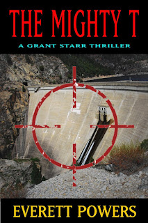
The cover art for THE MIGHTY T is ready to go, I think. I just need to finish the back cover. I dragged my feet on that because I was waiting for some good blurbs, or testimonials. I have those so I am without that excuse now.

My last excuse is my archaic computer and software. I think this Windows XP computer is six or seven years old and the software is even older. I use Word 97, for crying out loud. I used to use PageMaker but haven't for ten plus years. I formatted THE MIGHTY T for print on an old copy of MicroSoft Publisher. I plan on turning the document into a PDF with a print program called PDF995--old school. It wouldn't work with Word but it seems to be working with Publisher.

I know that I've lost a few sales by not having a printed copy available but I'm not sure how many. THE MIGHTY T could be marketed locally, because it's set locally, and in the San Francisco area, because the Hetch Hetchy Reservoir is owned by the City of San Francisco. I need a print copy to properly market locally.

Now that I've rambled on, I'd like to get some feedback from others, writers or readers.

For writers who have printed copies of their books, has it helped your overall sales and your ebook sales?

For readers, would you buy an ebook if the printed book wasn't available? (Especially if you prefer printed books.)

Monday, August 1, 2011

Want To Know Who The Bad Guy Is?

    “Like I said, I didn’t think you had,” Grant said. “But I’m going to ask you the same question I asked the Sierra Club and the Environmental Defense Fund: can you recall ever kicking anyone out of your group for espousing violence?”
    There was another pause. “Who did you talk to at the Sierra Club?”
    “Tom Richardson.”
    “Hmm.... Did he say he knew anyone like that?”
    “He said maybe, but he would have to check into it. Why?”
    “I’m surprised he didn’t mention Samuel Raimes.”
    “Well, he didn’t. Who’s Samuel Raimes?” Grant wrote the name on his pad.
    “I’m not saying he’s involved in this,” Cranston said. “I haven’t heard anything about him for, oh, eight or nine years. For all I know he could be in prison by now.”
    “Tell me about him.” Grant was all ears; he finally had a name, someone to run down.
    “I did some computer work for the Sierra Club years ago and had to attend a few board meetings. They talked about Raimes in one of the meetings.”
    “What’d they say?”
    “That he was tired of waiting for the judges and politicians to do something about the... Let’s see... Something to do with salmon.” Cranston went quiet for a few moments while he thought. “I remember now. He was upset about the salmon counts in the Tuolumne River. They were dropping and he didn’t feel enough was being done about it. That’s true, by the way. The Chinook salmon are nearly extinct in some rivers.”
    Grant said, “I’ve heard that.”
    “He wanted the Tuolumne River and the Delta returned to their natural state, which, unfortunately, will never happen. But I don’t remember them saying he wanted to blow up anything or kill someone. They just said he was crazy.”

In a "who done it," there are two ways to reveal who the bad guy is: you can keep it a secret until the end, or nearly the end, or you can tell the reader early on. Both methods have merit.

Making the reader wait until the end of the story allows you to build suspense, perhaps more so than tipping your hand early on. 

The most common way to handle the identity of a bad guy is to make it one of the characters the reader is familiar with, but was completely unaware it was him or her. It could be the jealous aunt, or, yes, even the butler. It should be a big shock the reader didn't see coming. When watching films on TV or DVD, it's always fun to stop the show and guess "who done it." A clever author will have most guessing wrong.

I've written that I read a lot of John Sandford books (all of them, in fact). Sandford occasionally keeps the identity of the bad guy(s) hidden while still letting the reader know something about him or her. He'll give the bad guy a nickname, such as something the press might be calling him. In his first novel, the bad guy was called "Maddog." The reader didn't know the Maddog's true identity until about halfway through the story, but that didn't stop Sandford from telling you a lot about him.

In THE MIGHTY T, I let the reader know who the bad guy is in the first chapter; I even let the cops know who he is early on. It's still fun to watch them go about trying to catch him because he's always a step ahead, the characters are interesting, the dialogue is good, and there's enough action to keep your attention even though you already know "who done it."

If the story is well-written, I enjoy both ploys. How about you?